
flexboxのプロパティめっちゃある!
最近HP作成の依頼でかなりflexを多用する機会があったので、備忘録として。
これは要素を横並びにするとても便利で主流な手法なので今更ですが、誰かの参考になれば幸いです。
flexコンテナとflexアイテム
基本的な使い方としては、横並びにしたい子要素を親要素のdivで囲み、cssで親要素に「display: flex;」記述するだけでOKです!
flexboxの親要素を「flex container」子要素を「flex item」といいます。
基本的なHTMLとCSSの記述下記の通りです!
<div class="parent">
    <div class="child_1">1</div>
    <div class="child_2">2</div>
    <div class="child_3">3</div>
    <div class="child_4">4</div>
    <div class="child_5">5</div>
</div>.parent{
display: flex;
width: 300px;
height: 150px;
background-color: #f5deb3;
}
.child_1,.child_2,.child_3,.child_4,.child_5{
font-size: 30px;
padding: 2px 3px;
margin: 10px;
color: #ffffff;
border: double 5px #B8860B;
background-color: #DEB887;
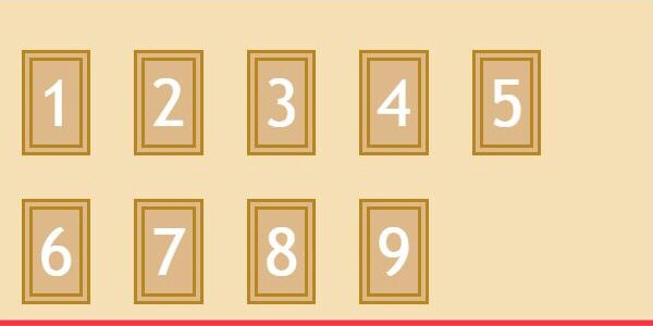
}親要素:flexコンテナのプロパティ
親要素に記述することで子要素の位置を指定することができるプロパティをまとめてみました!
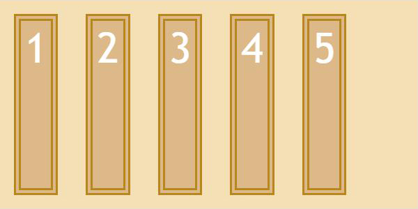
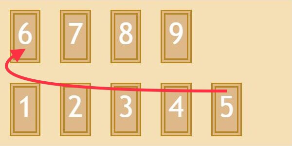
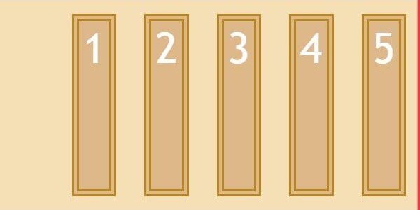
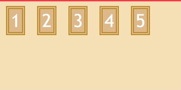
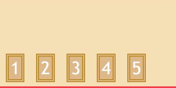
flex-direction:子要素の並び順
row(初期値)
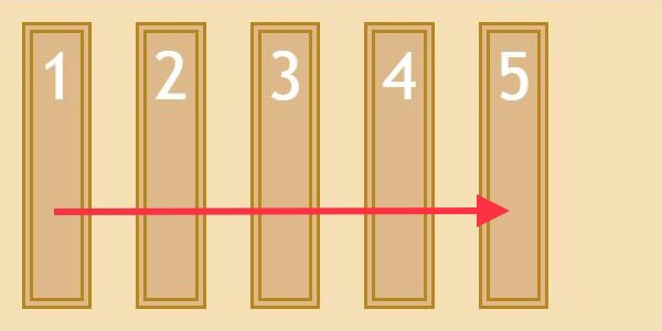
左から並べる
column
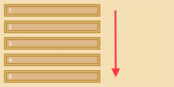
上から並べる
row-reverse
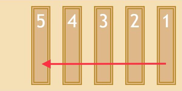
右から並べる
column-reverse
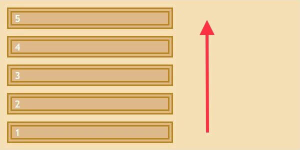
下から並べる
See the Pen JjRBapw by とりとん (@darakerutoriton) on CodePen.
See the Pen flex-direction : column; by とりとん (@darakerutoriton) on CodePen.
See the Pen flex-direction : row-reverse; by とりとん (@darakerutoriton) on CodePen.
See the Pen flex-direction : column-reverse; by とりとん (@darakerutoriton) on CodePen.
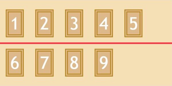
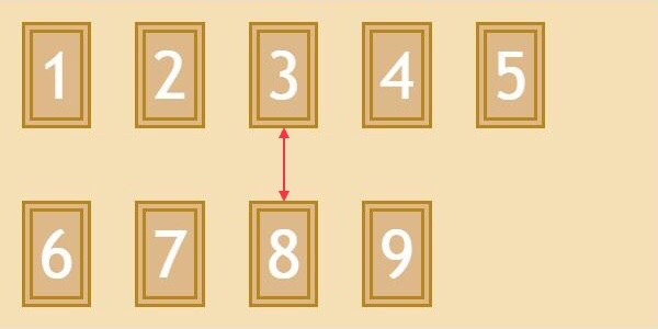
flex-wrap:子要素の折り返し
nowrap(初期値)
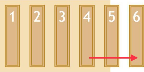
親要素に関係なく1行に並べる
wrap
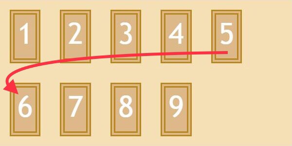
親要素に合わせて下へ折り返す
wrap-reverse
親要素に合わせて上へ折り返す
See the Pen flex-wrap: no-wrap; by とりとん (@darakerutoriton) on CodePen.
See the Pen flex-wrap: wrap; by とりとん (@darakerutoriton) on CodePen.
See the Pen YzGjJqq by とりとん (@darakerutoriton) on CodePen.
■ flex-flow
子要素の並び順と折り返しは、まとめて記述することができます(例)⬇️
See the Pen flex-flow: column wrap; by とりとん (@darakerutoriton) on CodePen.
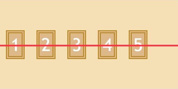
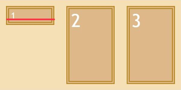
justify-content:子要素の横位置
flex-start(初期値)

左寄せ
flex-end
右寄せ
center
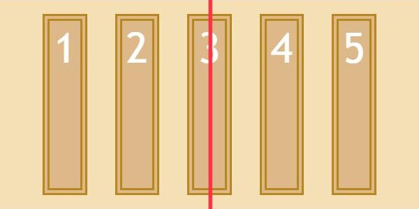
中央寄せ
space-between
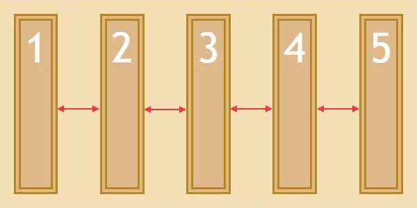
子要素の横幅に均等の余白
space-around

均等の余白+端に半分の余白
See the Pen justify-content: flex-start; by とりとん (@darakerutoriton) on CodePen.
See the Pen justify-content: flex-end; by とりとん (@darakerutoriton) on CodePen.
See the Pen justify-content: center; by とりとん (@darakerutoriton) on CodePen.
See the Pen justify-content: space-between; by とりとん (@darakerutoriton) on CodePen.
See the Pen justify-content: space-around; by とりとん (@darakerutoriton) on CodePen.
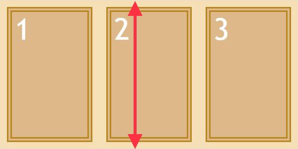
align-items:子要素の縦位置
flex-start
上寄せ
flex-end
下寄せ
center
中央寄せ
stretch(初期値)
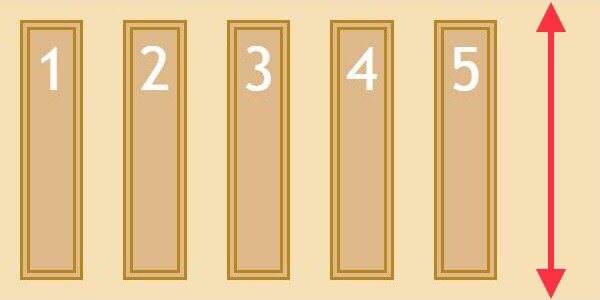
親要素の縦幅に合わせる
baseline
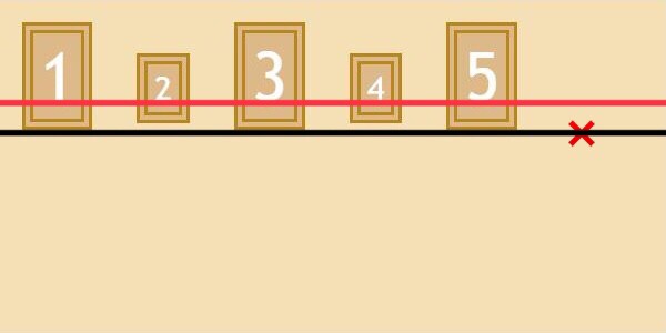
テキストの下線に揃える
See the Pen align-items: flex-start; by とりとん (@darakerutoriton) on CodePen.
See the Pen align-items: flex-end; by とりとん (@darakerutoriton) on CodePen.
See the Pen align-items: center; by とりとん (@darakerutoriton) on CodePen.
See the Pen align-items: stretch; by とりとん (@darakerutoriton) on CodePen.
See the Pen align-items: baseline; by とりとん (@darakerutoriton) on CodePen.
align-content:複数行の縦位置
flex-start
上寄せ
flex-end
下寄せ
center
中央寄せ
space-between
子要素の縦幅に均等の余白
space-around

均等の余白+端に半分の余白
See the Pen align-content: flex-start; by とりとん (@darakerutoriton) on CodePen.
See the Pen align-content: flex-end; by とりとん (@darakerutoriton) on CodePen.
See the Pen align-content: center; by とりとん (@darakerutoriton) on CodePen.
See the Pen align-content: space-between; by とりとん (@darakerutoriton) on CodePen.
See the Pen align-content: space-around; by とりとん (@darakerutoriton) on CodePen.
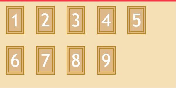
子要素:flexアイテムのプロパティ
子要素に記述することで、個別に位置を指定することができるプロパティをまとめてみました!
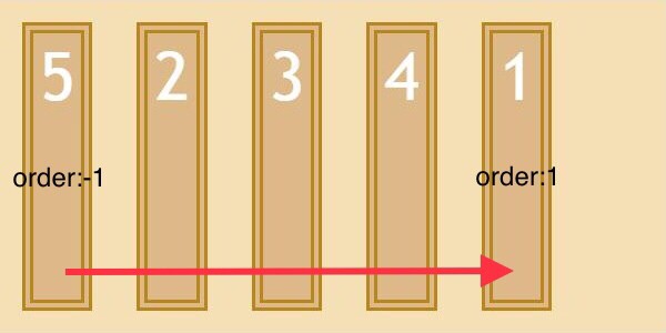
order:子要素の順番
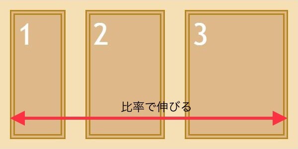
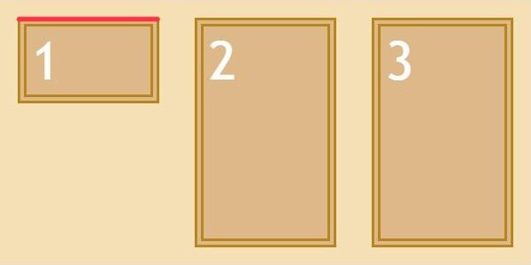
flex-grow:子要素の伸び率
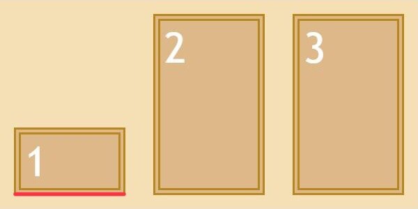
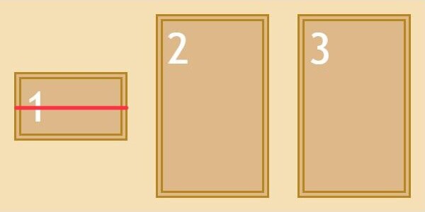
flex-shrink:子要素の縮み率
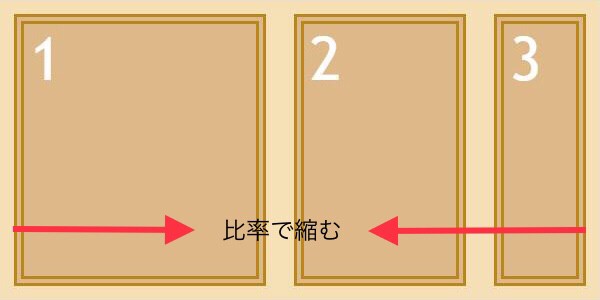
flex-growとflex-shrinkの計算方法はこちら⬇️

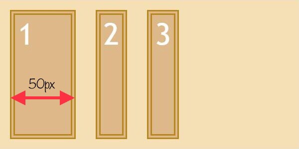
flex-basis:子要素の横幅
■ flex
子要素の伸縮比率と横幅は、まとめて記述することができます(例)⬇️
See the Pen flex_ by とりとん (@darakerutoriton) on CodePen.
align-self:子要素個別の縦位置
これはあまり使用する機会は無いかもですが、興味があれば!
flex-start
上寄せ
flex-end
下寄せ
center
中央寄せ
auto(初期値)
親要素の縦幅に合わせる
stretch
親要素の縦幅に合わせる
baseline
テキストの下線に揃える
See the Pen flex-start by とりとん (@darakerutoriton) on CodePen.
See the Pen flex-end by とりとん (@darakerutoriton) on CodePen.
See the Pen center by とりとん (@darakerutoriton) on CodePen.
See the Pen stretch by とりとん (@darakerutoriton) on CodePen.
See the Pen baseline by とりとん (@darakerutoriton) on CodePen.
最後まで読んでいただきありがとうございました!